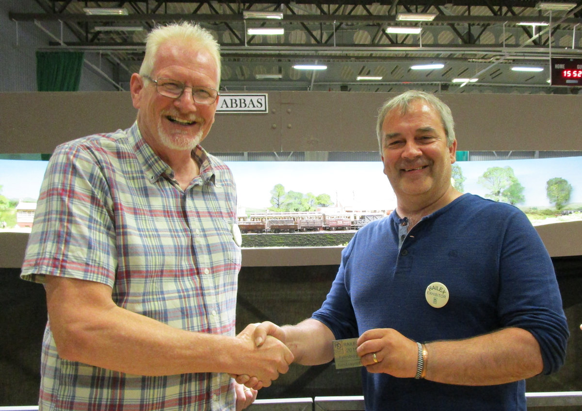
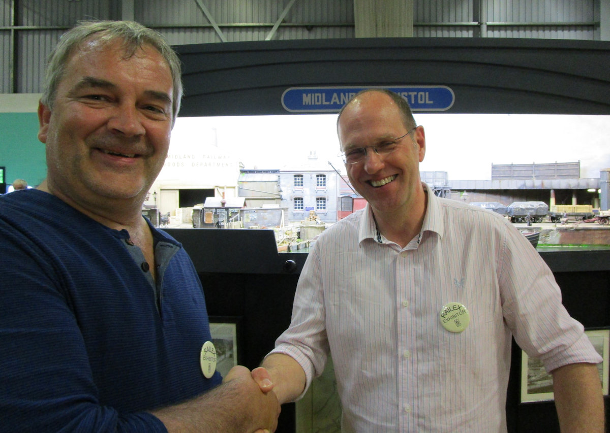
For the Best Model on a layout Jerry Clifford went round the exhibition to pick what he thought was the Best Model. The out come of this was the harbour buildings on Midland in Bristol.
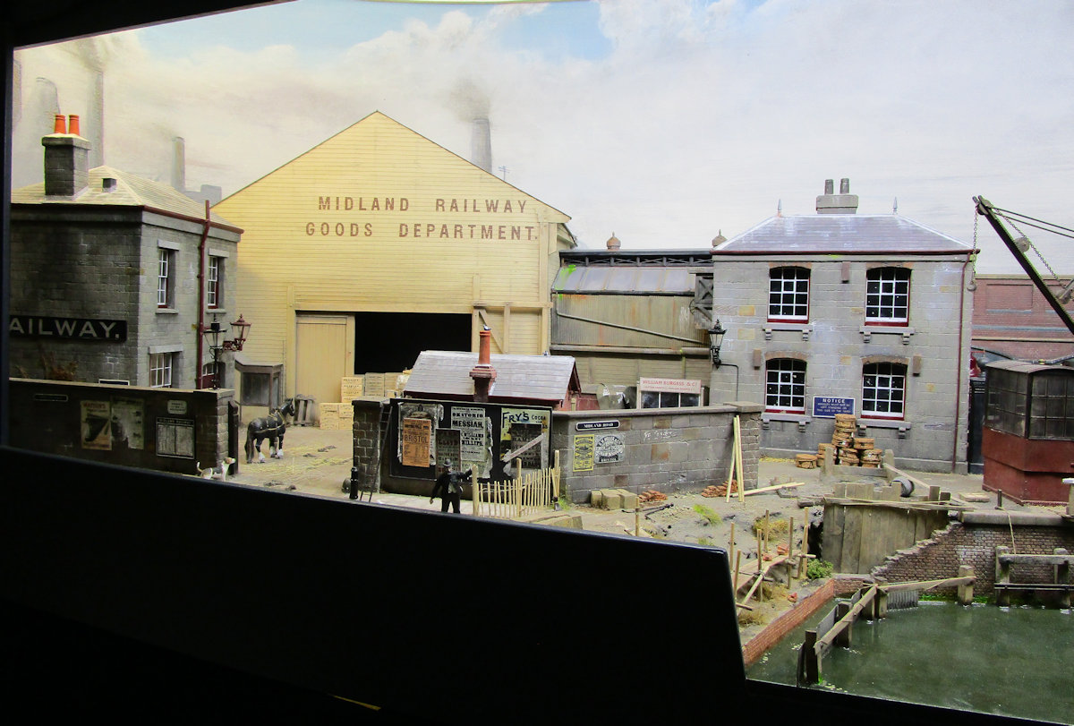
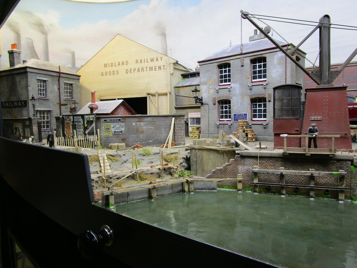
The warehouse and office area comprised a substantial part of Midland in Bristol and so it was important to get the proportions right - imposing but not overpowering. Comparisons with prototype photos show that they are slightly smaller and certainly condensed in depth. The back timber-clad warehouse hides the headshunt and is therefore a lot shallower than it looks. The open doorway with black-painted void gives the impression of much more beyond, with Ned and his dray emerging into the daylight.
Construction of the stone buildings consists of 6mm MDF walls, covered with DAS air-drying clay which was then scribed to represent the stonework. Painting was mostly using enamels for base colours with further colouring carried out using acrylics, more enamels and water-colour blendable pencils. Windows are CD case material with glazing bars painted on using a bow-pen. The slate roofs are strips of paper cut every slate width. The warehouse itself is also made using 6mm MDF, covered with paper strips to represent the ship-lap boarding. I have had quite a few questions regarding the method used to add the lettering, which was done using a widely-available font, but close to the prototype. This was then altered using Autocad to accurately copy the prototype. Once the letters were drawn in outline, they were printed off in reverse on a laser printer and a feint outline transferred onto the building using nail varnish remover. The outline was gone over using a bow pen and in-filled with a brush. This results in sign-writing that isn't transfer-perfect and helps to reproduce the subtle variation of the real thing. Weathering followed to highlight rows of nails following the lines of stud-work behind the ship-lap and a little wear and tear to the lettering.